 866.249.6095
Over the past few years, sales of smartphones have exploded. Everywhere I look, I see people glued to the screen of their iPhone, Galaxy, or Nexus device. We have passed the point where only teenagers and tech hipsters own iPhones, now there is a good chance your parents and grandparents own one as well. In a study published earlier this year by Nielson, 7 out of 10 Americans now own a smart phone. Nielson Study
People are in love with their phones and the freedom to access the internet anytime, anyplace. Even Google is predicting that mobile users will surpass desktop users sometime next year. The mobile era is here and everyone is happy. Well, almost everyone. For those of us who earn a living from our websites, things have been a little more challenging lately. Cell phone screens are small and reading text from a website can be difficult and frustrating — often resulting in the user leaving the site and moving on to the next one.
Of course we are not the only ones that have noticed this kind of behavior. Google has been studying how mobile users react to websites for years, and it seems they are finally ready to weigh in on the subject. Enter the “mobile friendly tag.” That’s right Google is now tagging websites that they deem a good experience for mobile users. Google has tested these kinds of tags before, but for the first time we are now seeing a Global implementation of the tag. This of course is a signal that Google is ready to
commit to a separate set of ranking factors for mobile friendly websites. Google has already admitted that they demote sites that are not mobile friendly, will this new tag be part of a mobile rankings boost?

How do you know if your website is mobile friendly?
On November 18, 2014 Google released the mobile friendly test, for Google Developers. Anyone can visit this page, enter their website URL and see the results. The test looks at website elements such as coding, site speed, the size of your text and how close together your menu links are.
As you can see www.icoastalnet.com passed with flying colors.

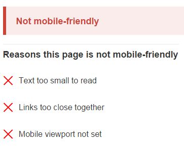
This is what it looks like if your site fails.
To keep your website at the top of the search results and in front of your audience, we suggest a responsively designed website. Responsive design is currently best way to ensure a good user experience across multiple devices, including smart phones, tablets, desktops, and is also recommended by all major search engines.