 866.249.6095
Trends are often indicators of a collective shift in thinking and evolve into more substantial change on a large scale. Although many trends foreshadow things to come, shortsighted businesses often dismiss them as not worth the investment in time and money needed to keep current.
Over the last few years in the web industry, responsive design has been considered by some to be simply a ‘trend’ in the negative sense of the word. This thinking may have been understandable a few years ago, but providing responsive website solutions is now a necessity. Businesses who are not prepared for the inevitable change are going to have to deal with the repercussions . Technology is constantly changing and it’s impossible to keep up with every new buzzword, but to disregard a major conceptual change like responsive design is a surefire way to box yourself out of the modern web landscape. Responsive design is not simply a ‘trend’, it’s part of a much more pervasive change in consumer buying habits and behavior.
What Do Your Customers Gain From Responsive Design
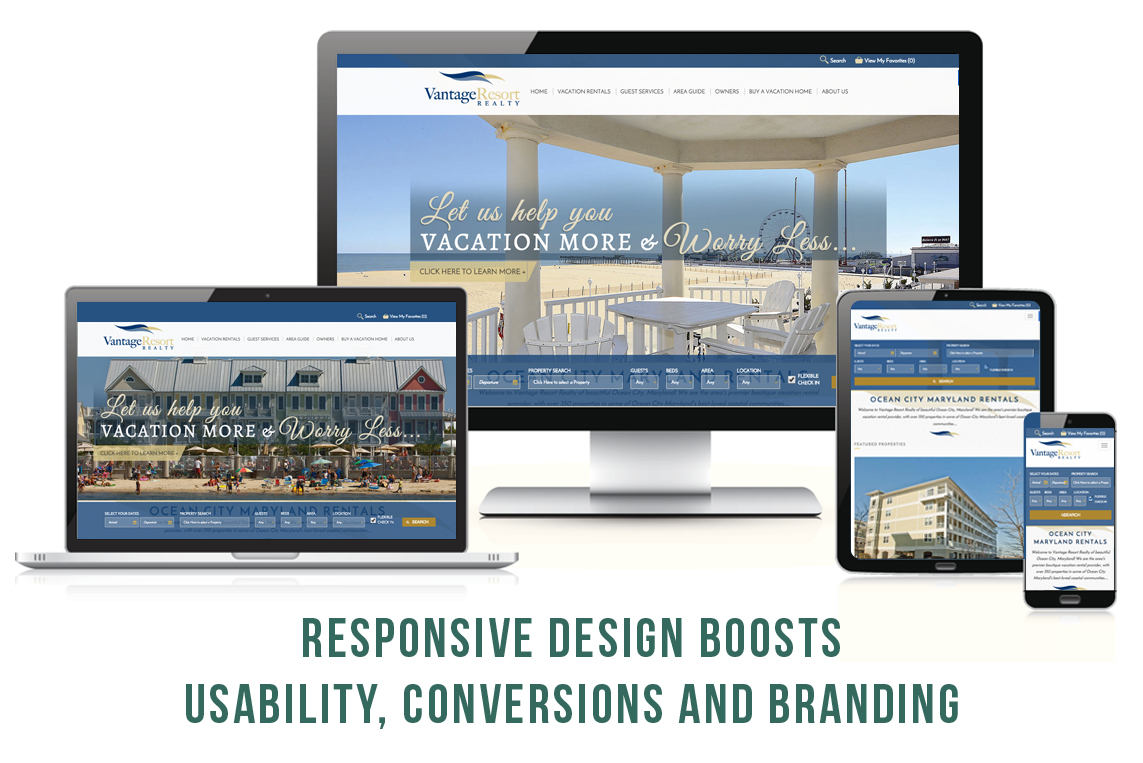
Consumers now spend more than 60% of their time using digital media on mobile. In addition to many other benefits, a Responsive build strategy boosts usability, increases conversions and presents a unified, branded look for your business. These results are possible due to content being catered to the way the end user is viewing the site. Using this design framework, consumers will not be frustrated by a negative user experience on your site, which happens too often when only traditional desktop sites or completely separate mobile sites, or ‘m dots’, are used. 61% of mobile users end up leaving sites because of negative browsing experiences, and there is a good chance they will end up on a competitor’s site instead of yours. Although mobile sites can be a stop gap in a world that requires a mobile friendly interface, this approach can create a fragmented experience for the user.
Being Consistent Is Important
Understanding consumer buying habits can be tricky, but by providing a fully thought-out, seamlessly branded, experience regardless of how a customer is viewing a website, responsive design removes a lot of the guesswork. In the same way that a company brands itself with more traditional means such as print advertising and in-store interactions with customers, providing a consistent online presence can be just as important. Responsive design makes it possible to use the same voice for your company across various devices and computers. This approach has been shown to lower bounce rates significantly while increasing conversions, sometimes up to 60%, visit duration, and revenue (in some cases up to 100% increase).
With over 46% of all internet searches being done on tablets and smartphones, any technology company seriously interested in benefitting their clients has to find a way to provide them with a cohesive, branded web presence. At Intercoastal Net Designs, we use Twitter Bootstrap as a core of standards-compliant code that our designers and programmers can use along with their customized design and programming. We chose Bootstrap specifically because it is proven within the web industry and provides a recognizable interface for users. Our customers have become accustomed to quality user experience and this responsive approach allows for client edits through our CMS to affect all devices immediately, which is not true with separate mobile sites. Content is not very helpful if it doesn’t reach all of your intended audience due to outdated technology.
Google Is Weighing In
Not only has it become clear that users have a negative reaction to sites that are not mobile friendly, the all powerful Google has stepped in and drawn a line in the sand. As you may know, April 21st is the scheduled date for the Google Mobile Friendliness Update. As of this update, it is going to cost you, literally, if your site is not responsive. If your site is not deemed mobile-friendly by Google’s new standard, your company’s ranking, and bottom line will soon be directly affected.
Many companies still treat the mobile and tablet experience as an afterthought, but with an industry standards now being established by search engines like Google, it’s time to make the jump. For anyone hesitant about using responsive design, keep in mind that although trends come and go, being responsive to your clients purchasing habits is always in style.