 866.249.6095
You’ve heard it before. Email Marketing is an easy and in expensive way to stay in front of your consumer. Keep them in the know, and keep you on their mind. It’s a tried and true method, and we don’t see the importance of email marketing going away any time soon. But are you gaining all the leads you should be? Is your campaign working for you? What can you do to convert more leads from these eblasts?
A good way to measure a successful eblast, is by looking out how many people read the eblast, and then how many people clicked. Clicks are extremely important. If someone clicks, that means they’re very interested in what you’re offering. Interested enough to go to your website and read more. Getting them to click is reeling them in and making them more like to convert into a sale. But how to you get them to click? Now there’s a million dollar question. Over the past few months, our marketing team has been studying and testing different eblast designs, to see if the design makes a difference on conversions.
The results are in: The way your eblast is designed significantly affects the number of people who click over to your site!
Our testing has shown that the most successful eblasts are eblasts that have teasers that prompt people to click for more information, as oppose to block text. Block text means they have to read, right away. Your viewers might just hit delete instead of spending the time to read it to see if they’re even interested. But if you tease them with different article titles and descriptions, and link each to a blog post or page on your website, your capturing more qualified leads. Most people are only going to click on what they are truly interested in. Now, instead of having to wade through a long email to figure out if it applies to them, they can glance over the eblast quickly, and then click on something that catches there eye!
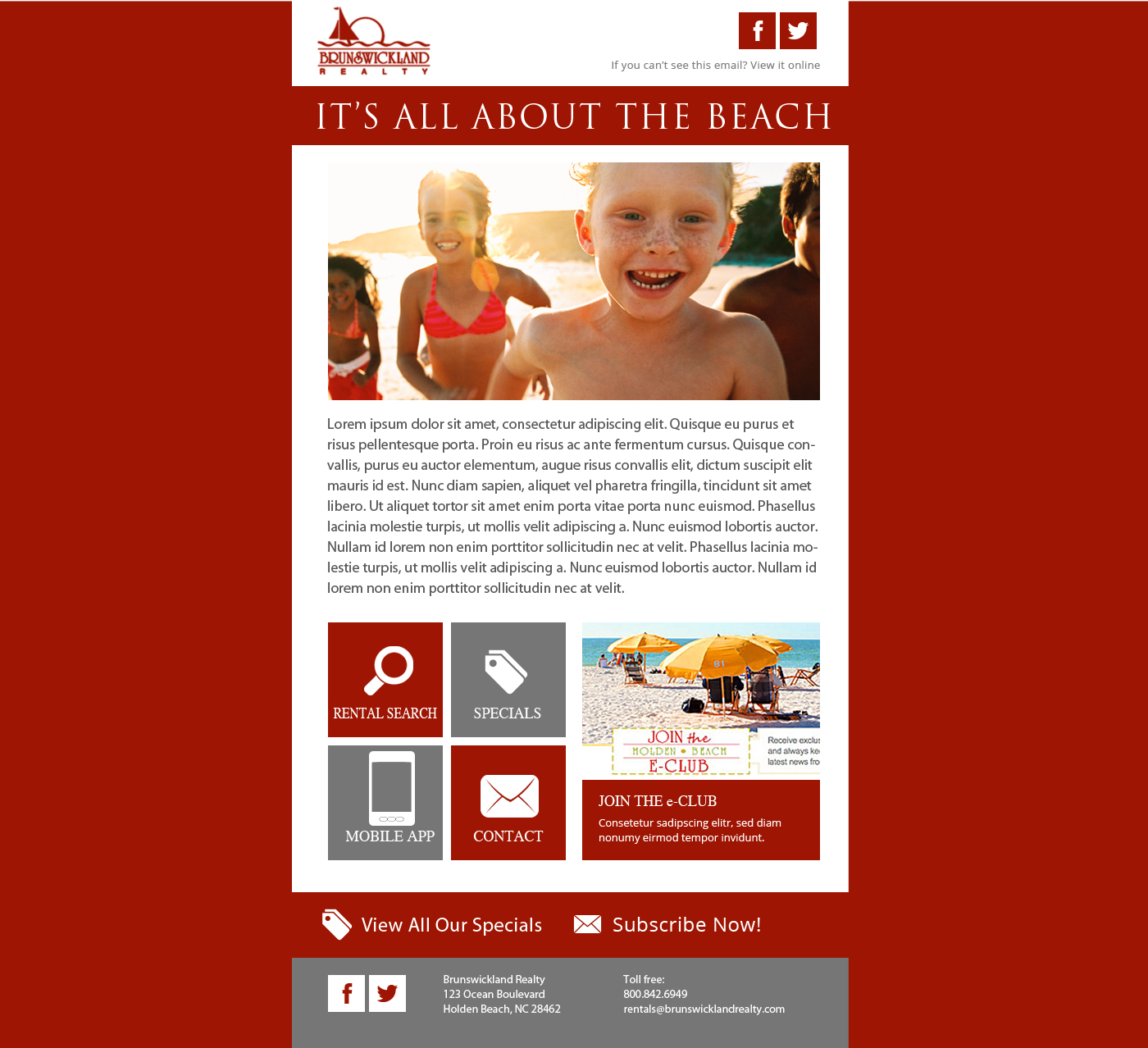
The below eblast is the 2013 version. This eblast has a clean design and is mobile friendly, but has a spot for a large block of text. This block of text would vary from month to month, talking about specials, what was going on in the area, etc. The eblast also had clickable boxes, but it wasn't the meat of the eblast.
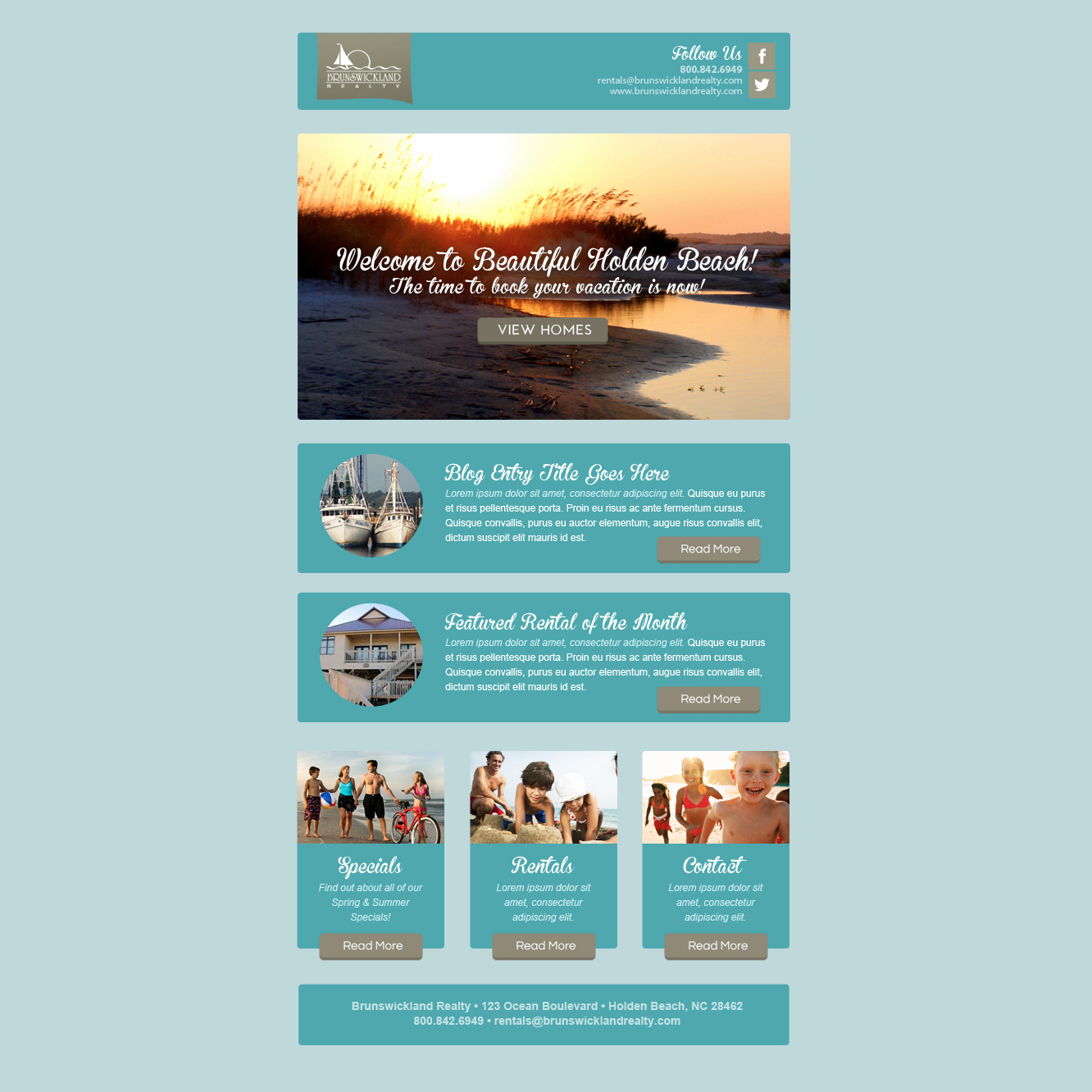
Next see their 2014 version, with block text eliminated, and article links/teaser text instead. Going forward, each month we will be chaning out the pictures and text to actual articles and pages relevant to that time period. With this past eblast design, they receive over 500 more clicks than the average block text 2013 eblast!
They’re not the only ones! We have had other clients experience a 4% or more increase in clicks once they switched over to a newer design! We are even using this same format on our email marketing pieces and have seen a large jump in traffic. Any form of email marketing is better than none, but if you’re going to do it, why not do it in a way that will encourage maximum results?